Choosing Card Color Combinations That Look Planned
A practical way to choose colors for a handmade card: one neutral, one main color and a small accent, tested with scraps before gluing, plus five ready-made palettes.
Tutorial at a glance
Materials
- Cardstock scraps in the colors you are considering
- A white or kraft card base
- Patterned paper to pull colors from (optional)
- Scissors
Good card color combinations rarely come from knowing color theory. They come from limiting the number of colors, deciding which one is in charge, and checking the papers side by side before any glue is involved. A card with three well-chosen colors looks more considered than one with eight beautiful ones.
The habits below apply to the cardstock you already own. None of them is a rule.
Start with a neutral and one main color
The safest starting point is a white or kraft card base plus a single color you like. White makes every color look cleaner and brighter. Kraft, the warm brown of plain wrapping paper, makes colors look softer and suits reds, whites, navy and greens especially well.
Then add at most two more: a second color that supports the main one, and a small accent. If a design seems to need a fourth color, try a lighter or darker shade of one you already have before reaching for something new.
Color proportions: the 60-30-10 guideline
Equal amounts of three colors compete with each other. A common guideline from interior and graphic design is to split them unevenly: about 60 percent for the dominant color, 30 percent for the secondary and 10 percent for the accent. Nobody measures this on a card. It simply means one color clearly leads, one supports, and one appears in a small dose.
On a card front that could be a cobalt mat covering most of the base as the large area, a white panel as the medium area, and one sunshine-yellow circle as the accent. The accent is the smallest piece and gets the most attention, so put it where you want the eye to go, usually on or next to the focal piece.

Neighbors for calm, opposites for energy
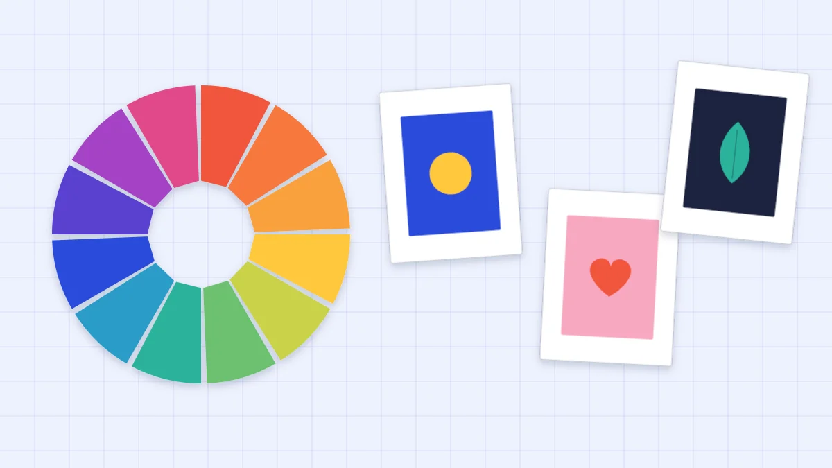
You only need two ideas from the color wheel. Colors that sit next to each other on the wheel, such as blue, blue-green and green, or pink, red and orange, blend quietly. Use neighbors when the card should feel gentle: sympathy, thank-you, new baby.
Colors on opposite sides of the wheel, such as blue and orange, yellow and violet, or red and green, push against each other and both look more intense. Use opposites when the card should feel lively. They work best in unequal amounts, with one as the main color and the other as the accent.
One color in light and dark
A single color in two or three shades is the hardest palette to get wrong. Pale blue, mid blue and navy always belong together, because they are the same color at different strengths. Add white and you have a complete palette.
Make sure the shades are clearly different, since two blues that are almost the same look like a failed attempt to match. This approach suits layered designs, where each mat steps one shade away from the one beneath; the guide to layering cardstock covers the cutting.
Pull colors from patterned paper
A sheet of patterned paper is a palette someone has already balanced. Pick out two or three of the colors printed in it and find solid cardstock to match. Use the patterned paper for one element, such as a band or a panel, and the matching solids for the mat and the focal piece.
Match in daylight if you can, holding the solid cardstock right against the pattern. A near miss is more noticeable than a clear contrast, so when you cannot match a color, go for a neutral instead.
Neutrals as rest areas
White, cream, kraft, gray and navy are neutrals for card-making purposes. They give the eye somewhere to rest between stronger colors and can be added to almost any palette without counting as an extra color.
- White is crisp and makes brights look brighter.
- Cream is softer than white and flatters warm colors such as red, orange and gold-yellow.
- Kraft adds warmth and a handmade feel.
- Gray calms bright yellow, pink and mint.
- Navy does the job of black with less harshness, and is a good choice for mats and thin outlines.
For the differences between paper finishes and how they affect color, see the guide to cardstock for card making.
Ready-made palettes
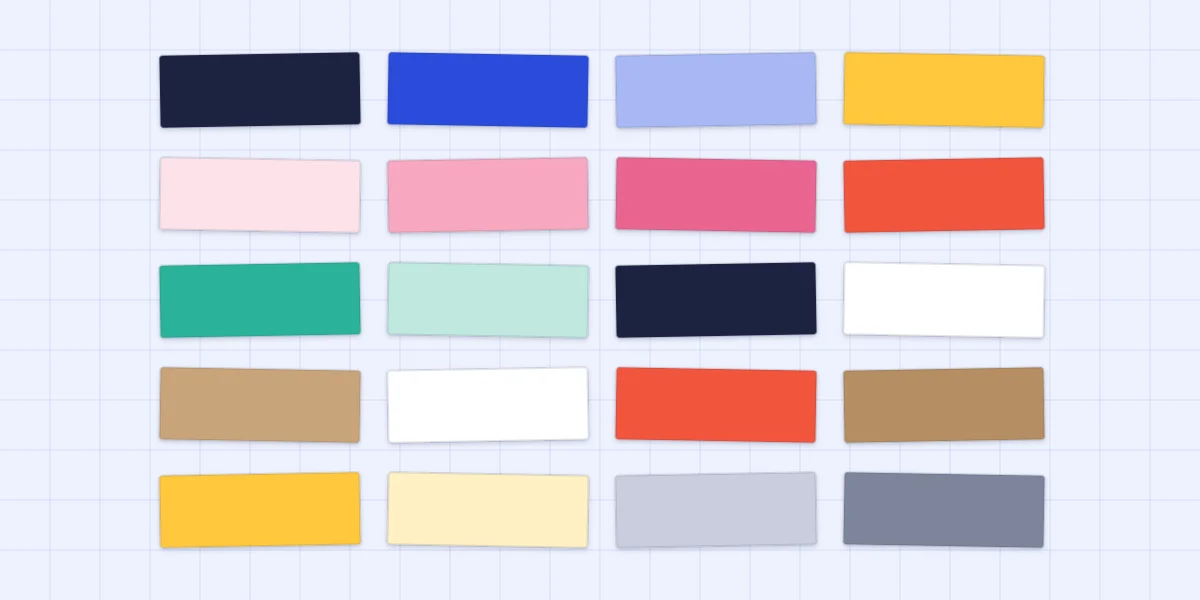
These five combinations use common cardstock colors and work on a white or kraft base. Each row gives the main color first.
| Palette | Colors | Mood | Good for |
|---|---|---|---|
| Blues with yellow | Pale blue, cobalt, navy, a yellow accent | Fresh and confident | Birthdays, congratulations |
| Pinks with red | Pale pink, mid pink, deep pink, a red accent | Warm and affectionate | Love, friendship, thank-you |
| Mint with navy and white | Mint, a lighter mint, navy, white | Clean and modern | Any occasion, minimal designs |
| Kraft with white and red | Kraft, a darker kraft, white, a red accent | Rustic and cozy | Winter holidays, thank-you |
| Yellow with gray | Yellow, pale gray, mid gray, white | Cheerful but calm | New baby, get-well, hello |
The occasions in the last column are suggestions. Conventions such as red and green for Christmas or pastels for a new baby are optional; a navy and mint holiday card or a bright birthday card in kraft and white is just as valid.
Test with scraps before you glue
The quickest way to judge a combination is to see it. Cut or tear a small piece of each paper, roughly in the proportions you plan to use: a large piece of the main color, a medium piece of the second, a small piece of the accent. Lay them overlapping on the card base and step back.
Look for three things. Does one color clearly lead? Does the accent stand out from both of the others? Is there enough difference between light and dark that the shapes will read from across a table? If the answer to any of these is no, swap one scrap and look again.
Watch out
Two colors of the same strength, such as mid red on mid green, blur where they touch even though the colors are different. Squint at the scraps: if the edge between them disappears, make one lighter or darker, or put a thin white mat between them.
Once the palette is settled, decide where each color goes. The arrangements in card layout ideas show where to put the large, medium and small areas, and minimalist handmade cards shows how well white plus one or two colors can work.
Frequently asked questions
How many colors should a handmade card have?
Two or three colors plus a neutral such as white or kraft is enough for most cards. If a design seems to need more, try a lighter or darker shade of a color already in the palette before adding a new one.
What is the 60-30-10 guideline?
It is a proportion guideline borrowed from interior and graphic design: roughly 60 percent of the area in a dominant color, 30 percent in a secondary color and 10 percent in an accent. On a card it simply means one color leads, one supports and one appears in a small dose.
Do I have to use traditional colors for an occasion?
No. Conventions such as red and green for winter holidays or pastels for a new baby are optional. A handwritten greeting tells the recipient what the card is for, so the colors can suit the person instead.