Minimalist Handmade Cards: Clean Designs With Very Few Supplies
One focal element, plenty of white space and careful placement. The principles behind minimalist cards, with three clean designs to make.
Tutorial at a glance
Materials
- White cardstock for the card base
- Small cardstock scraps in yellow, blue, red and mint
- Scissors
- Paper trimmer, or craft knife, metal ruler and cutting mat (adult use)
- Ruler and pencil
- Glue stick
- Fine-tip pen
- A coin or bottle cap to trace circles
A sheet of white cardstock, one scrap of color and a glue stick are enough for minimalist handmade cards. That short list is the appeal, and it is also the difficulty. With one small shape on a white card front, there is nothing to distract from a slanted cut, a smear of glue or a shape that sits in an awkward spot.
Minimalist does not mean empty or unfinished. It means every piece on the card is there on purpose and the space around it is part of the design. The principles below make that deliberate, and three example cards put them into practice.
One focal element
Decide on a single thing for the eye to land on: a circle, a heart, a leaf, a strip. Everything else on the card either supports it, like a thin stem under a leaf, or is left off.
A useful test is to cover any element with a fingertip. If the card looks the same or better without it, remove it. Small focal pieces work best. On an A2 card, 4.25 x 5.5 in (10.8 x 14 cm), a shape of about 3/4 to 1 inch (2 to 2.5 cm) has plenty of presence.
White space is part of the design
The empty area gives the focal piece its weight. A small circle surrounded by a wide margin looks intentional, while the same circle crowded by borders, dots and strips becomes one detail among many.
As a rough guide, leave at least three quarters of the card front bare. The bare area also gives you a natural home for a short handwritten greeting, kept small and placed with the same care as the shape. Many minimalist cards carry the greeting inside and leave the front wordless.
A limited palette
White plus one color is the classic choice. White plus two colors works when one of them is used very sparingly, such as a blue strip with a tiny red heart. Kraft or soft gray can stand in for white as the base.
Strong, saturated colors hold up best at a small size; a pale shape on white can vanish. If you are choosing a pair, the guide to card color combinations explains which colors calm each other and which compete.
Precise placement
Where the focal piece sits matters more than what it is. Two ideas cover most cases.
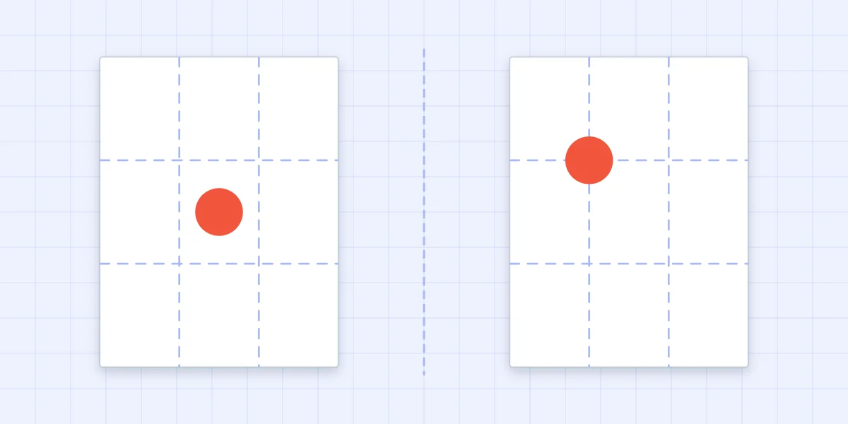
The rule of thirds. Imagine the card front divided into three equal columns and three equal rows. The four points where the dividing lines cross are strong positions. A shape placed on one of them, for example the upper-left crossing, looks balanced but alive. The same shape in the exact center looks static, like a button.
The visual center. When you do want a centered design, place the element slightly above the measured middle. A shape at the true center appears to be sliding down the card. Raising it by about 1/4 in (6 mm) on an A2 card corrects that.
To find a thirds point without drawing on the card, cut a scrap the size of the card front, fold it into thirds both ways, and use the creases as a map. Then make one tiny pencil dot on the real card where the shape will go. More layouts built on the same idea are in card layout ideas.
Clean cutting and gluing
Nothing hides mistakes on a card like this, so slow down on the basics.
- Edges: cut strips with a paper trimmer, or have an adult cut them with a craft knife and metal ruler on a cutting mat, away from the holding hand. Scissors struggle to keep a thin strip parallel. The guide on how to cut cardstock cleanly covers each tool.
- Circles: trace around a coin or a bottle cap on the back of the cardstock and cut with long, smooth strokes, turning the paper and not the scissors.
- Glue: use a glue stick or the smallest amount of liquid glue, kept back from the edge of the shape. Glue that squeezes out dries shiny on white cardstock.
Watch out
Do not try to slide a shape into place after it touches liquid glue. It leaves a faint trail on the white surface. Hover the piece over its pencil dot, lower it straight down and press.
Three designs to try
Each uses a white A2 side-fold base. Sizes are suggestions.
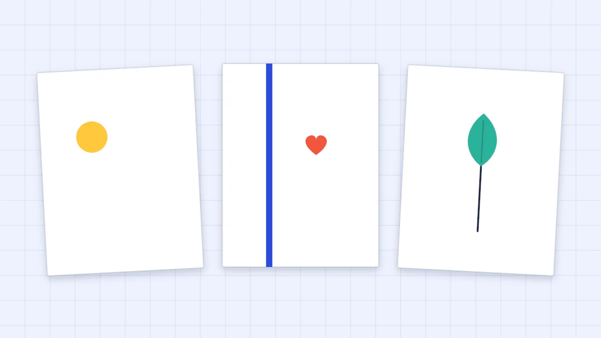
One small circle, off-center
- Cut a yellow circle about 1 inch (2.5 cm) across.
- Mark the upper-left thirds point of the card front with a pencil dot.
- Glue the circle centered on the dot. Leave everything else bare.
A thin vertical strip with a tiny heart
- Cut a blue strip 1/4 in (6 mm) wide and 5.5 in (14 cm) long.
- Glue it from top to bottom of the card front, about one third of the way in from the left edge. Check that it is parallel to the fold before pressing.
- Cut a red heart about 1/2 in (1.3 cm) tall from a folded scrap and glue it just to the right of the strip, a third of the way down.
A single line with one paper leaf
- With a fine-tip pen and a ruler, or freehand for a softer look, draw one thin stem rising from near the bottom of the card, about 2.5 in (6.5 cm) long. Practice the stroke on scrap first.
- Cut a mint leaf about 1 inch (2.5 cm) long from a folded scrap so both sides match.
- Glue the leaf at the top of the stem, tilted slightly. Glue only the base of the leaf if you want the tip to lift and cast a small shadow.
Placement at a glance
| Element | Where to place it | Why it works |
|---|---|---|
| Small circle or dot | On an upper thirds crossing | Off-center balance; wide space below for a greeting |
| Thin vertical strip | One third in from the left or right edge | Divides the front into unequal, restful parts |
| Leaf on a drawn stem | Rising from the lower third, slightly off-center | The line leads the eye up to the leaf |
| Centered shape | Slightly above the measured middle | Looks centered instead of sinking |
| Handwritten greeting | Small, low on the front, or inside | Keeps the focal piece the main event |
Before the card goes into its envelope, check it under good light for stray pencil dots and glue marks. The guide to finishing a handmade card shows how to remove both without damaging the surface.
Frequently asked questions
What makes a card minimalist?
A minimalist card has one focal element, a lot of empty space around it and a very limited palette, usually white plus one or two colors. The placement of the single element is planned carefully, and the cutting and gluing are kept very clean because nothing else hides mistakes.
Where should I place a single shape on a card?
Divide the card front into thirds both ways and place the shape where two of the lines cross. That position looks balanced without being static. For a centered design, set the shape slightly above the measured middle so it does not appear to sink.
How do I keep a minimalist card from looking unfinished?
Use a strong color for the focal piece, place it deliberately and make sure the edges are crisp. A short handwritten greeting, small and carefully positioned, also signals that the empty space is intentional.