Card Layout Ideas: Simple Sketches That Always Work
Six dependable card layouts described as plain blocks, with advice on rotating them, placing the handwritten greeting and planning with a pencil thumbnail.
Tutorial at a glance
Materials
- Pencil and scrap paper for thumbnails
- Ruler
- Card base and cardstock scraps
- Scissors or a paper trimmer
- Glue stick or liquid glue
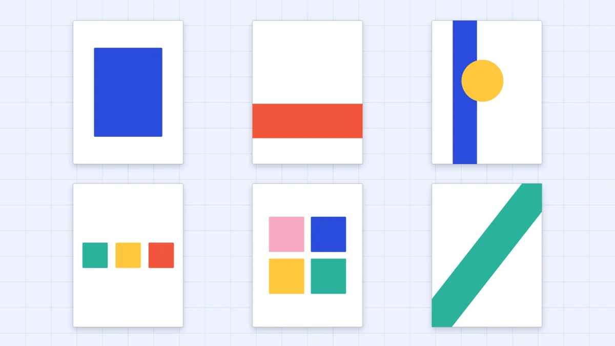
Staring at a blank card front with a pile of cut paper is the slowest part of making a card. A short list of card layout ideas removes that pause: you pick an arrangement that is known to balance, then decide what goes in each spot. The six layouts below cover most occasions and work on any card size.
All of them are described as plain blocks, so you can fill them with whatever you like to cut: hearts, leaves, stars, stripes or squares of patterned paper.
What a card sketch is
Card makers call a reusable arrangement a sketch. It is a diagram of blocks, a rectangle here, a strip there, a circle on top, with no colors and no subject. A sketch tells you where things go and roughly how big they are, and nothing else.
That is why using one is not copying. The same sketch can become a birthday card with balloons or a thank-you card with a flower, and no two will look alike.
Six layouts that always work
1. Centered panel
One matted panel in the middle of the card front with an even border, and the focal piece in the middle of the panel. It is calm, symmetrical and the easiest to get right. The guide to layering cardstock gives the mat sizes.
2. Horizontal band across the lower third
A strip of color or pattern, about 1 to 1.5 in (2.5 to 4 cm) tall on an A2 card, runs edge to edge across the lower third. The focal piece sits on or just above the band. The band anchors the design the way a horizon anchors a picture.
3. Vertical strip with an overlapping focal piece
A strip about 1 to 1.5 in (2.5 to 4 cm) wide runs from top to bottom, set in from the left edge. A circle or other shape overlaps the strip, half on and half off it. The overlap links the two blocks; without it they look like separate ideas.
4. Three in a row
Three shapes of the same size sit side by side across the middle with equal gaps: three hearts, three stars, three squares. Vary the color and keep the shape, or the other way around. The simple handmade cards collection includes a row of three hearts built this way.
5. Grid of four or six squares
Squares of about 1.25 in (3 cm) are arranged two by two or two by three with narrow, equal gaps. Fill each with a different paper, or leave most plain and put a small shape in one. The even spacing is what makes a grid look sharp, so rule light pencil guides first.
6. Diagonal sweep
Elements travel from one corner to the opposite one: a slanted band, a drift of leaves, a scatter of confetti dots. A diagonal gives movement, which suits celebrations. Leave the two empty corners clear so the sweep has room to read.
The six layouts at a glance
| Layout | Blocks | Mood | Where the greeting fits |
|---|---|---|---|
| Centered panel | One panel, one focal piece | Calm, classic | Under the focal piece or inside |
| Lower band | One wide strip, one focal piece | Grounded | On the band or above it |
| Vertical strip | One tall strip, one overlapping shape | Modern | In the open space to the right |
| Three in a row | Three equal shapes | Friendly, simple | Below the row |
| Grid | Four or six squares | Orderly, graphic | In one square or inside |
| Diagonal sweep | A slanted band or drift | Lively | In an empty corner |
Rotate or flip a layout to get a new one
Each layout is really several. Turn the card a quarter turn and the lower band becomes a side strip; the vertical strip becomes a band with a shape resting on it. Flip a layout left to right and the strip moves to the right-hand side, which changes where the eye lands first.
The same goes for card orientation. Every layout here works on a tall side-fold card and on a wide top-fold card, though the proportions shift: three in a row has more room on a wide card, and the vertical strip is stronger on a tall one.
Tip
When a layout feels crowded, remove a block before you shrink anything. Empty space is part of the arrangement, and the article on minimalist handmade cards shows how far a single small element can go.
Where the greeting goes
Plan the space for the handwritten greeting as one of the blocks, not as an afterthought. A greeting squeezed into whatever gap is left usually ends up tilted or cramped.
Three positions are reliable. The first is directly below the focal piece, centered, which suits the centered panel and three in a row. The second is on a band or strip of plain light paper, where the strip doubles as a writing line. The third is the open area that the layout leaves on purpose, such as the right-hand side beside a vertical strip. If none of these has room, put the greeting inside the card and let the front stay purely visual.
Write the greeting lightly in pencil first so you can check the spacing before going over it in pen.
Plan with a pencil thumbnail before you cut
A thumbnail is a tiny drawing of the card front, about 1 x 1.5 in (2.5 x 4 cm), made with a few pencil lines. It shows the arrangement without using any cardstock.
- Draw a small rectangle in the same proportions as your card.
- Block in the largest shape first, such as the strip or panel.
- Add the focal piece as a simple circle or square and mark where the greeting will go.
- Draw two or three versions side by side, moving one block each time, and pick the one that looks balanced.
- Cut the real pieces and lay them on the card base dry, matching the thumbnail, before any glue comes out.
The dry arrangement is where you settle sizes. A strip that looked right in the drawing may need to be narrower at full size, and it is easier to trim a loose piece than a glued one. Choose colors at this stage too; a layout holds together best with one main color and one accent, as explained in the guide to card color combinations.
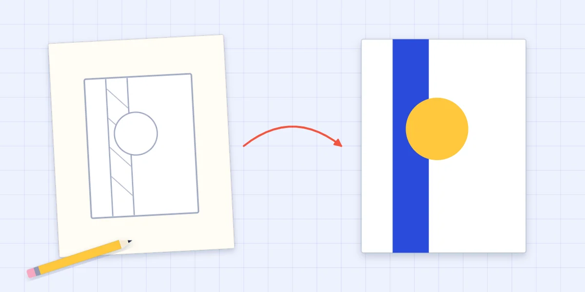
Layouts also give loose scraps a structure: the same blocks can be filled with torn or cut paper, as shown in the guide to collage cards.
Frequently asked questions
What is a card sketch?
A card sketch is a simple diagram of blocks that shows where the panel, strips, focal piece and greeting sit on a card front. It has no colors or subject, so you can reuse it for any occasion and fill it with your own shapes and papers.
Which card layout is easiest for a beginner?
The centered panel is the easiest, because everything is symmetrical and any small error is simple to spot and fix. Three in a row is a good second layout, since it only asks you to cut three matching shapes and space them evenly.
Can the same layout work on a top-fold card?
Yes. Every layout can be turned a quarter turn or flipped left to right. Check the proportions with a quick pencil thumbnail first, because a strip or band may need to be wider or narrower when the card is wide instead of tall.